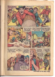
A very Whitney top panel - but look at the figure on the right at he top. That's a total Kirby pose.
#117 reprints an Ogden Whitney story from the same series years before. “Three Rode Together” (originally appeared in
Two-Gun Kid #89) is a very Jack Kirby looking Ogden Whitney effort. There’s no listing for an inker on the indicia – so I’m left to assume Whitney inked himself on this one. It’s really heavy-handed Marvel style inking compared to Whitney’s ACG work. You can imagine editor Stan Lee telling Whitney to make this western look like the other issues of
Two-Gun Kid – meaning make it look like Kirby. It was fun for me to discover this comic in the quarter bin. I’d never seen it. Dan was like, “Oh, yeah, I have some of those. I think that’s some of Whitney’s last professional work.” I was startled at how “3-D” looking the pages are in comparison to Whitney’s “flat” space in most of his ACG work. Whitney is famous for his flat, stage-like compositions in Herbie and in his romance comics work. So, it’s really odd and somehow thrilling to see Whitney’s compositions go “in” to the panel. He seems to be imitating Kirby’s layered approach. Y’know what I mean – when Kirby has a strong foreground, middle ground and background all in one panel.
Kirby most famously does this of course in his double-page splash pages but I think you can see this compositional strategy in every one of his pages. Look at the panel below in the gallery with the big laughing heads at the top of the page. That was the panel that really struck me. That panel is so unusual looking for Ogden Whitney. So, then I started looking at the rest of the book more clearly. There are some choice “Whitney moments” (check the guys using a log for a battering ram – that’s ALL Whitney except for the figure on the right of the panel) but it’s mostly a Kirby riff. Check out the hand of our hero when he falls off his horse. That’s a Kirby hand. And more than that, it’s coming towards the reader like most Kirby. But Whitney was so “flat” – for lack of a better term – that it’s
weird to see him composing panels that come at, come towards the reader. Whitney, of course, does have depth-of-field type panels in his other work but it’s generally simple and rather elegant. He plays with color and depth like an animated cartoon. Usually his “space” is very clean. Here in this western it’s all layered and messy. I like it. Add the layered compositions to the bulkiness of the figures AND the inking style and it all sort of works. I gotta say – it boggles the mind of a Whitney fan like me.


0 komentar:
Posting Komentar